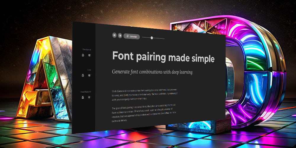
by Faizan Arshad | Aug 31, 2024 | Uncategorized
Designers, achieving that perfect font pairing can feel as elusive as finding the ideal peanut butter and jelly combination. The right fonts should complement each other, creating harmony and contrast without clashing. But let’s face it—finding that perfect match can...
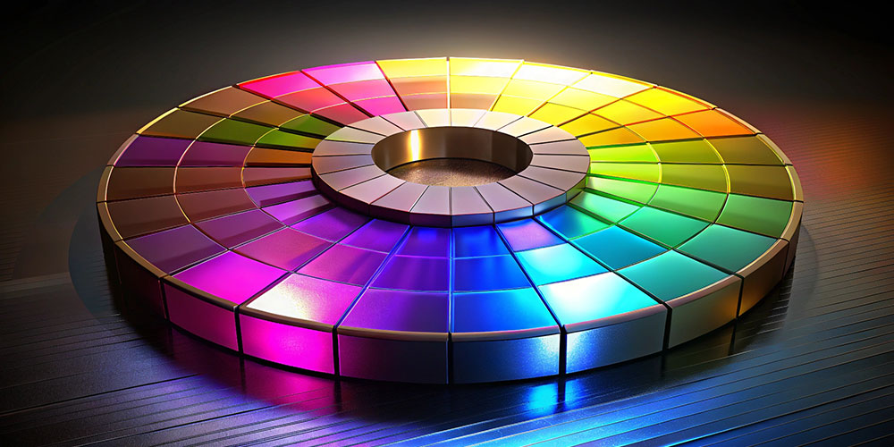
by Faizan Arshad | Aug 31, 2024 | Uncategorized
Designers, achieving harmony in your design can sometimes feel like a puzzle. If you’re struggling to create a cohesive and pleasing visual experience, consider turning to an analogous color scheme. This approach can bring a sense of balance and unity to your work,...

by Faizan Arshad | Aug 31, 2024 | General
Designers, think about this: You walk into a doctor’s office with a headache, and without even asking you about your symptoms, the doctor prescribes a digestion medicine. Doesn’t make much sense, right? Just as a doctor needs to understand your condition before...

by Faizan Arshad | Aug 31, 2024 | Uncategorized
Designers, if you’ve ever struggled with pairing font sizes in your designs, you’re not alone. Achieving the right balance between headlines, sub-heads, and body copy can be tricky. But there’s a timeless tool that can help you create a perfectly balanced type system:...
by Faizan Arshad | Aug 31, 2024 | Uncategorized
Designers love the elegance and harmony that the golden ratio brings to their work, especially when it comes to pairing font sizes. It’s a time-tested technique that can make your typography look beautifully balanced. However, while the golden ratio might be a...