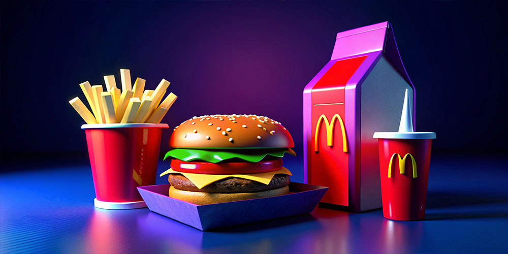
Designers, have you ever noticed that many food and beverage (F&B) brands prominently use the color red in their branding? From McDonald’s to Coca-Cola, red seems to be a popular choice. But what’s behind this trend? The color red is more than just a bold choice; it plays a crucial role in grabbing attention and influencing emotions. Here’s why red is a go-to color for F&B brands and how it can be effectively used in your designs.
The Psychology of Red
- Attention-Grabbing: Red is one of the most attention-grabbing colors in the spectrum. It stands out and catches the eye quickly, which is essential in the crowded world of F&B branding. This visibility helps brands stand out and make a strong first impression.
- Stimulates Appetite: Red has been shown to stimulate appetite and evoke feelings of hunger. This is why many restaurants and food brands use red in their logos, menus, and packaging. It can make food appear more appealing and encourage people to eat more.
- Emotional Impact: Red is a color associated with strong emotions such as passion, excitement, and energy. This emotional impact can enhance the overall dining experience, making it more memorable and enjoyable for customers.
How F&B Brands Utilize Red
- Brand Recognition: Brands like McDonald’s and Coca-Cola use red to create a recognizable and impactful brand identity. The color becomes synonymous with the brand’s image, helping consumers quickly identify and remember the brand.
- Design Elements: Red is often used in logos, packaging, and advertising to create a sense of urgency and draw attention. Its vibrant nature can make promotional materials more effective and engaging.
- Creating Atmosphere: In restaurant design, red is used to create a warm, inviting atmosphere. It can make a space feel more energetic and dynamic, encouraging customers to linger and enjoy their meal.
Practical Tips for Using Red in F&B Branding
- Balance with Other Colors: While red is powerful, it’s important to balance it with other colors to avoid overwhelming the viewer. Pair red with neutral tones like white or black to create a harmonious design.
- Consider the Brand’s Personality: Use shades of red that align with the brand’s personality and target audience. For example, a bright, vibrant red may be suitable for a casual eatery, while a deep, rich red might be more appropriate for a high-end restaurant.
- Test and Evaluate: Test different shades of red and design elements to see how they impact customer perception and behavior. Use feedback and analytics to refine your design for maximum effectiveness.
- Be Mindful of Cultural Context: Keep in mind that color perception can vary across cultures. Ensure that the use of red aligns with the cultural context of your target audience and does not unintentionally convey negative connotations.
Conclusion
Red is a powerful color in F&B branding, known for its ability to grab attention, stimulate appetite, and evoke strong emotions. By understanding the psychology behind red and using it strategically in your designs, you can create compelling and effective branding for food and beverage brands.
So, the next time you’re working on an F&B project, consider incorporating red into your design to leverage its attention-grabbing and appetite-stimulating qualities.