Designers, achieving harmony in your design can sometimes feel like a puzzle. If you’re struggling to create a cohesive and pleasing visual experience, consider turning to an analogous color scheme. This approach can bring a sense of balance and unity to your work, making it both aesthetically pleasing and harmonious.
What is an Analogous Color Scheme?
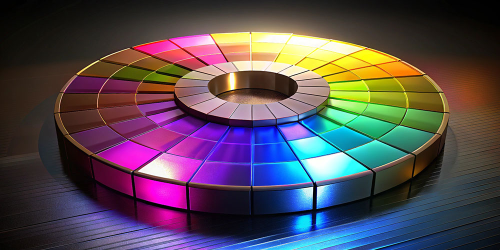
An analogous color scheme uses colors that are located next to each other on the color wheel. These colors share similar hues, creating a serene and comfortable design. This color harmony is often seen in nature and can be a powerful tool in design to evoke specific moods and feelings.
How to Use Analogous Colors in Your Designs
- Choose a Base Color: Start by selecting a base color from the color wheel. This will be the primary color of your design.
- Select Adjacent Colors: Pick one or two colors that are next to your base color on the color wheel. These will complement your base color and create a smooth transition in your design.
- Apply the Colors: Use your base color for the main elements of your design, and apply the adjacent colors for accents, backgrounds, or secondary elements. The close relationship between these colors will ensure a harmonious look.
- Experiment with Shades and Tints: To add depth and variety, experiment with different shades (darker versions) and tints (lighter versions) of your chosen colors. This can help maintain visual interest while keeping the harmony intact.
Examples of Analogous Color Schemes
- Warm Colors: Combinations like red, red-orange, and orange create a vibrant, energetic feel. Think of a sunset with its warm, soothing hues.
- Cool Colors: Blues, teal, and green offer a calming and refreshing atmosphere, reminiscent of a tranquil ocean or a lush forest.
- Earthy Tones: Colors like brown, brown-red, and yellow create an earthy, grounded aesthetic, similar to the colors found in autumn leaves or a sandy beach.
Analogous Colors in Nature
Interestingly, analogous color schemes are not just a design principle—they’re also prevalent in nature. Take our planet Earth, for example:
- Landscapes: Think of a forest where different shades of green create a lush, harmonious environment.
- Sunsets and Sunrises: The sky often features gradients of warm colors like orange, red, and pink.
- Seasons: Autumn presents a beautiful array of analogous colors, with reds, oranges, and browns blending seamlessly.
Why Analogous Colors Work
- Creates Harmony: The close relationship between analogous colors ensures a unified and pleasing look that feels naturally balanced.
- Evokes Specific Moods: Depending on the colors you choose, you can create a range of moods, from calming and serene to warm and inviting.
- Simplifies the Design Process: With a limited color palette, it’s easier to achieve a cohesive and visually appealing design.
Conclusion
If you’re finding it challenging to achieve harmony in your design, try using an analogous color scheme. By selecting colors that sit next to each other on the color wheel, you can create a visually harmonious and appealing design that evokes a specific mood or atmosphere. Embrace the natural beauty of analogous colors and let them guide you to a more cohesive and aesthetically pleasing result.
So, next time you’re designing, look to the color wheel and harness the power of analogous colors to bring your project to life.